Overview
The Michigan Sport Business Conference is an undergraduate-run platform designed to inspire and connect the next generation of sport business industry professionals. The conference is reaching its 8th annual conference in the Fall of 2019 and is in need of a fresh, engaging re-brand.
We decided to rely heavily on MSBC's already well known brand both on campus at the University of Michigan and in the sport business industry.
Design Goal
Design a brand that is ambitious, modern, professional and dynamic for the Michigan Sport Business Conference. Design while considering that it will serve as an "update" to the already well-established brand instead of serving as a "change" to the brand.
Process
Based on user research, the color palette would need to be brightened to represent the exciting and vibrant energy the conference exudes every year. The colors also needed to maintain a sense of professionalism, which called for more muted tones in the color palette.
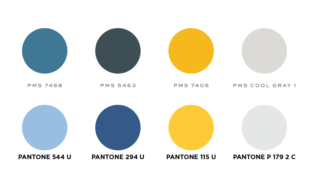
Original (top) colors v. New (bottom) colors
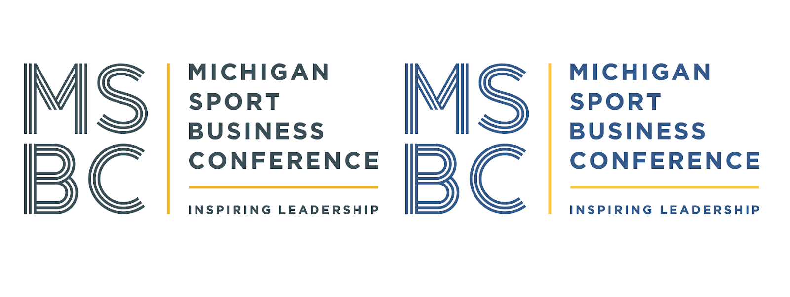
Original Logo treated with original colors (left) v. original logo treated with new colors (right)
Typography
My team and I explored different types of sans-serif fonts. Sans-serif conveyed a more modern and dynamic take on sport business. It also rendered better for social media, which was one of the original goals for the MSBC to upgrade its digital content.
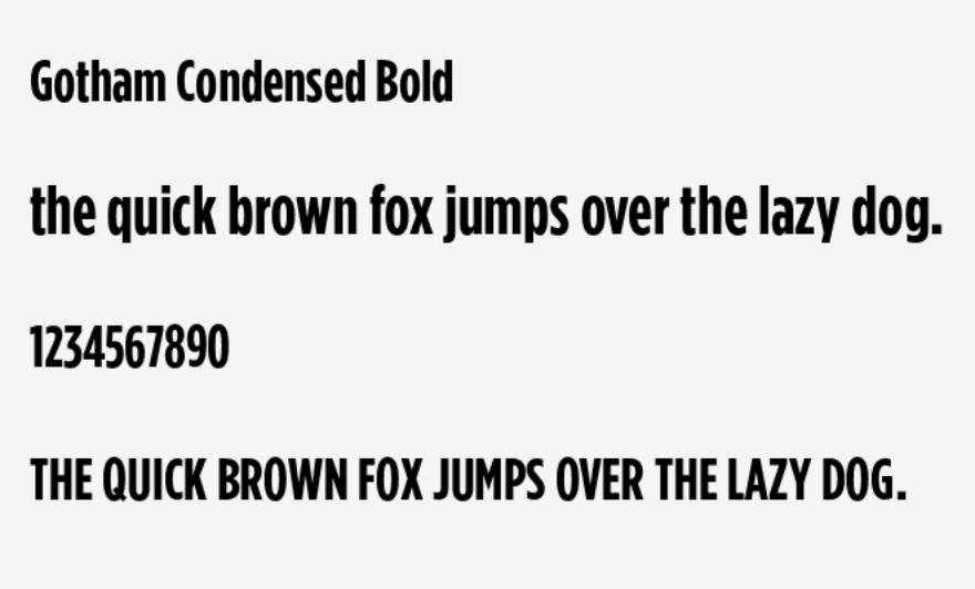
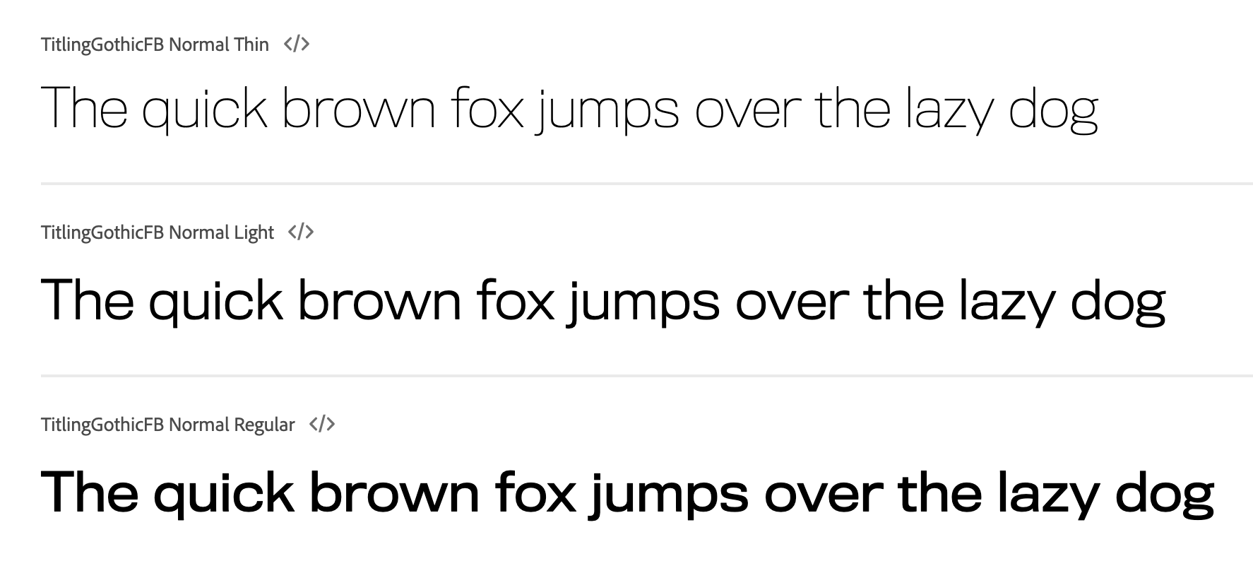
Ultimately, my team and I chose Gotham Condensed Bold. Its varied letter lengths gave the MSBC brand a more "friendly" approach, yet still maintained its professional appeal.
By gathering qualitative information from the other members of the student planning team and our Board of Advisors, we were able to determine that the newer colors, fonts and logos used was more favorable than the original design elements used.
Moving forward, my team began to apply this fresh new rebrand into specialized social media posts for Instagram, Facebook and LinkedIn.
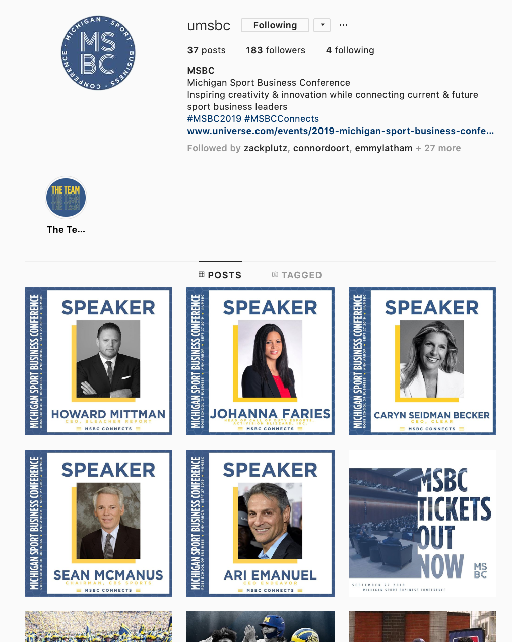
Check out the instagram here.

Website Redesign Overview:
Continuing our mission to rebrand the Michigan Sport Business conference, we strived to improve our digital content for this years conference in order to truly elevate the MSBC brand to a more modern, dynamic and exciting brand.
This meant redesigning the current MSBC website, which is where most of our traffic for ticket sales reside. Taking on this task, our primary goal was to increase accessibility for the conference by designing the website with ticket sales in mind.
Process:
The Brand Development began by examining the current MSBC website and taking note of its amenities. We sat down with other members of the Executive Board and our Board of Advisors and discussed which elements of the website architecture were successful and which were not.

After this, we did some rapid prototyping and jotted down our initial ideas of what our new website could look like.


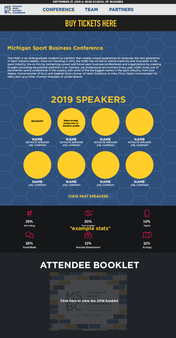
After completing this rapid prototyping, my team and I began creating mockups in Adobe CS6 that improved accessibility to Tickets, included a more organized information architecture, and had our most updated logos, colors and fonts. These wireframes below were our final iterations before sending them off to the developer.


Home Page
Conference page
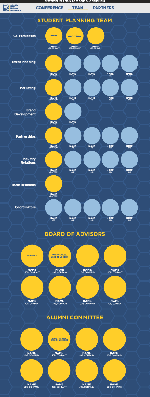
Team page
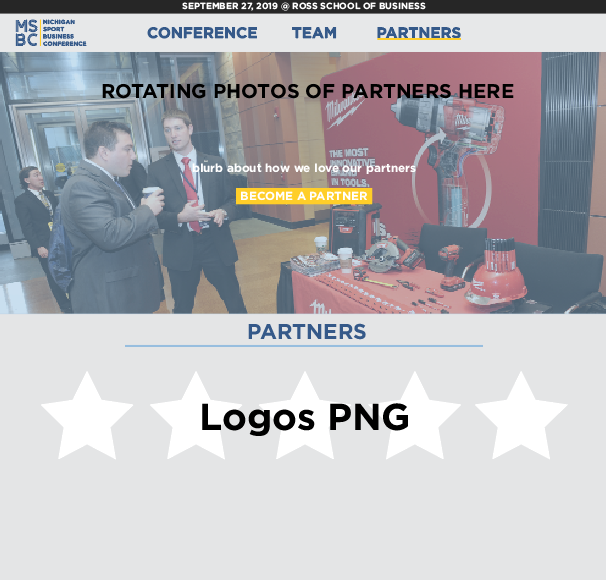
Partners page
After working with web developer, Karl O'Brien, the website has finally been published. You can check it out HERE.