Abstract
Students from the University of Michigan School of Information taking the Web Design, Development and Accessibility course were assigned to a UMSI professor to redesign his/her personal website. My group was assigned to redesign Dr. Oliver Haimson's website from scratch.
Initial Design Evaluation
While visiting Dr. Haimson's original site both on desktop and mobile view, we made the following observations:
- There was lots of scroll
- Almost all images were missing alt text
- The information was not organized in an intuitive way and lacked information hierarchy
- Text was not small and not readable
- From a glance, the desktop and mobile views look unorganized and the amount of information shown before the first scroll is overwhelming (shown below)

Initial Consultation
After taking time to make these observations, we consulted with our client, Dr. Oliver Haimson, about what pieces of information he thought were most important to have on his new site. We also asked him about features he would like included on his new site. We walked away with a few main takeaways:
- His research and news articles were the most important pieces of information on his site. He wanted them to remain visually prominent on his new site.
- He did not want a contact form embedded into his new site.
- He wanted all his information from his old site incorporated into his new site.
Design Goals
From this initial consultation and our assessment of the original site, my group and I put together three main goals for the design:
- Make website more accessible
- Re-organize information in a more user-friendly way
- Reduce scroll
Project Plan
With these goals in mind, my group and I came up with an 8-step project plan:
1. Decide what information should go on which page
2. Organize the information on each page so it reduces scrolling by coding a card template
3. Create wireframes of the potential design
4. Copy the original code into a code editor and reorganize it into the "card" code format
5. Create a horizontal nav bar for desktop and vertical for mobile view
6. Add missing alt text to images and logos
7. Add a reduced motion media query
8. Refine color scheme and ensure the site passes on w3, aXe and WAVE validators.
Wireframes
We decided to maintain the color scheme of a light blue, white, dark grey and light red from the original website. We started to sketch out potential ideas and eventually refined them into prototypes made on illustrator.
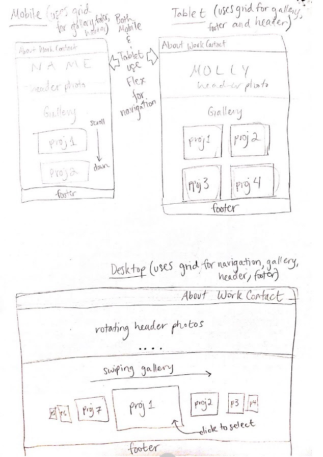
Wireframes made on Illustrator
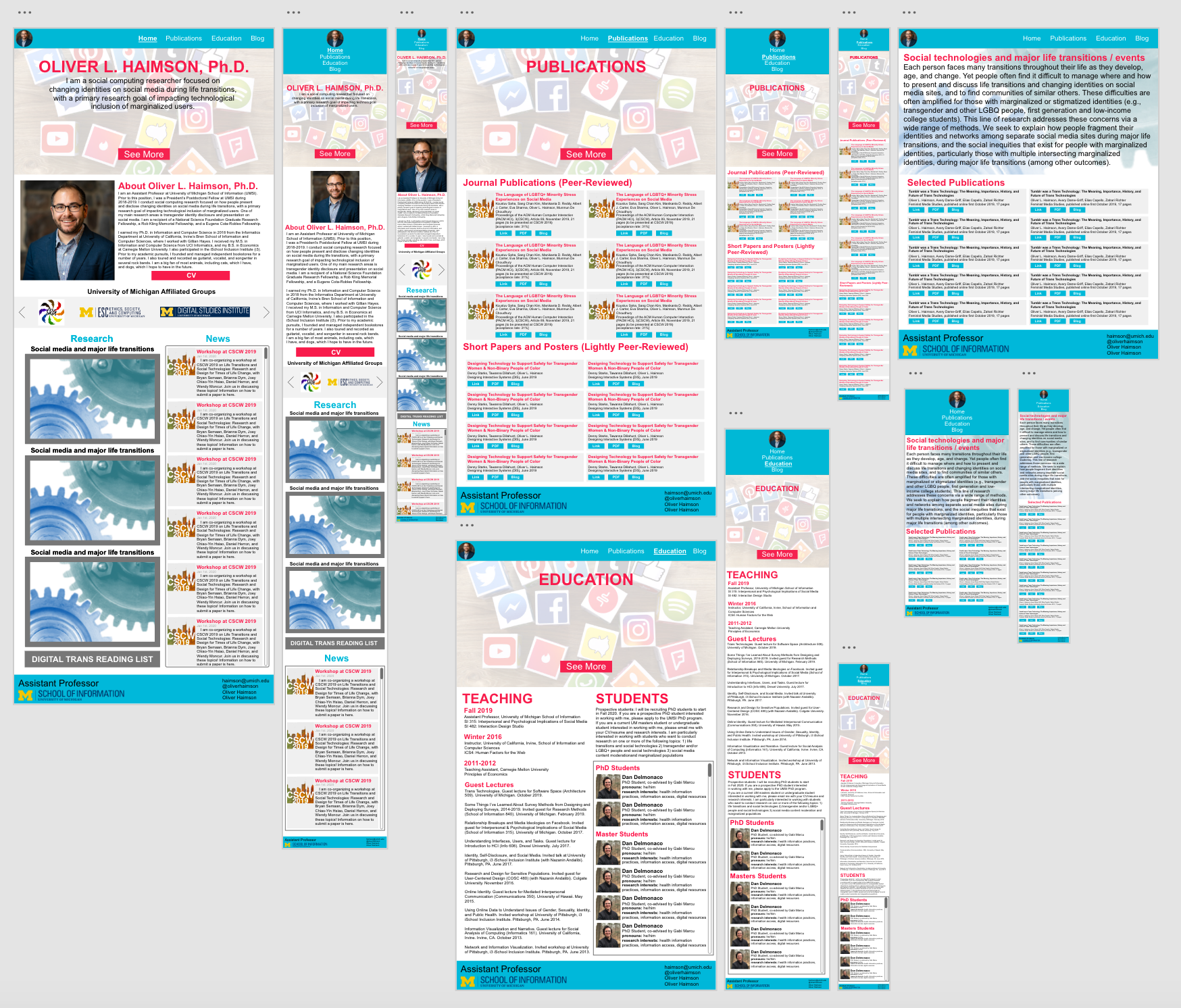
Final Product
The final product can be found here on github. A glance at the desktop and mobile view is shown below.
How We Achieved Our Goals
- We made the website more accessible by adding any missing alt text to images or logos, adding a reduced motion media query, adding adequate color contrast to the color scheme, and making information tabbable.
- We Re-organized the information from the original website in a more user-friendly way. We did this by combining the content from the Home, About, and CV page into one cohesive Home page on the new site, and combining the content from the Students and Teaching page into one cohesive Education page. We also reorganized memberships into a rotating carousel of organizations on the new Home page.
- We reduced scroll by combining a grid system with card formats that allowed the news articles and publications to be organized in two columns instead of one. The card formats made each publication look cleaner and more distinguished when hovered over with a mouse. We also used iFrames to create a box that continued to scroll through additional news publications.
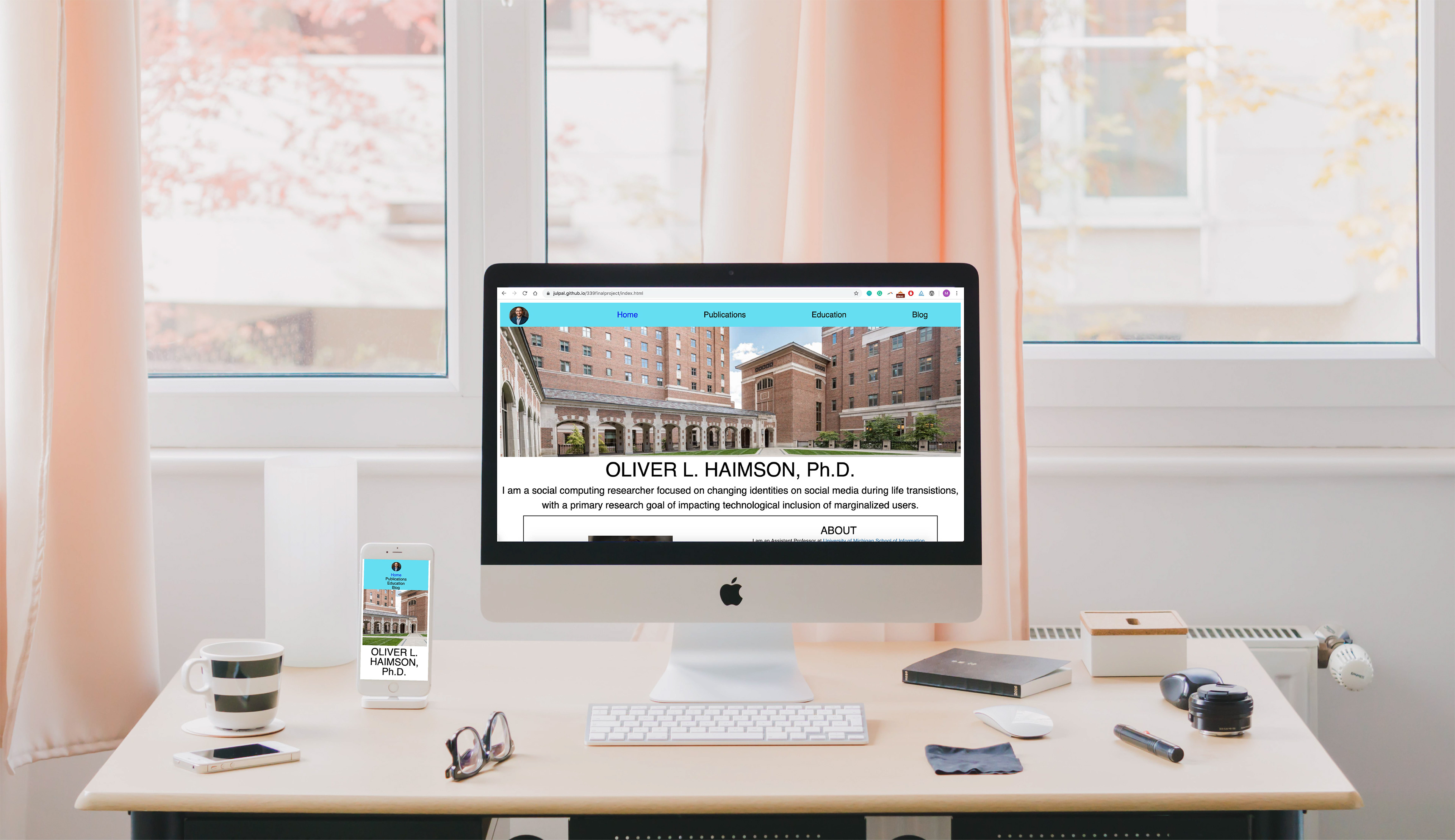
Final website design for desktop and mobile view. Full version can be found on github here.